.jpeg)

5 modern website designs to find inspiration for your projects
What’s a Rich Text element?
The rich text element allows you to create and format headings, paragraphs, blockquotes, images, and video all in one place instead of having to add and format them individually. Just double-click and easily create content.
Static and dynamic content editing
A rich text element can be used with static or dynamic content. For static content, just drop it into any page and begin editing. For dynamic content, add a rich text field to any collection and then connect a rich text element to that field in the settings panel. Voila!
How to customize formatting for each rich text
Headings, paragraphs, blockquotes, figures, images, and figure captions can all be styled after a class is added to the rich text element using the "When inside of" nested selector system.
Don’t fall behind the trends with out-of-date website designs.
There's no denying the importance of modern website design. Studies show that visitors form an impression of a website within seconds, with design, content, and usability as the most crucial factors. Design, however, is by far the most significant driving force.
Websites that follow modern web design trends help brands stand out from the crowd. Having a memorable or impressive site captures visitors’ interest and creates a positive impression of your brand from the beginning.
We’ve put together five modern website examples for inspiration to get you started.
5 trendy websites to inspire your next design
From clean and compact to captivating and colorful, here are five exciting websites to spark your next web design idea.
1. By Alice Lee
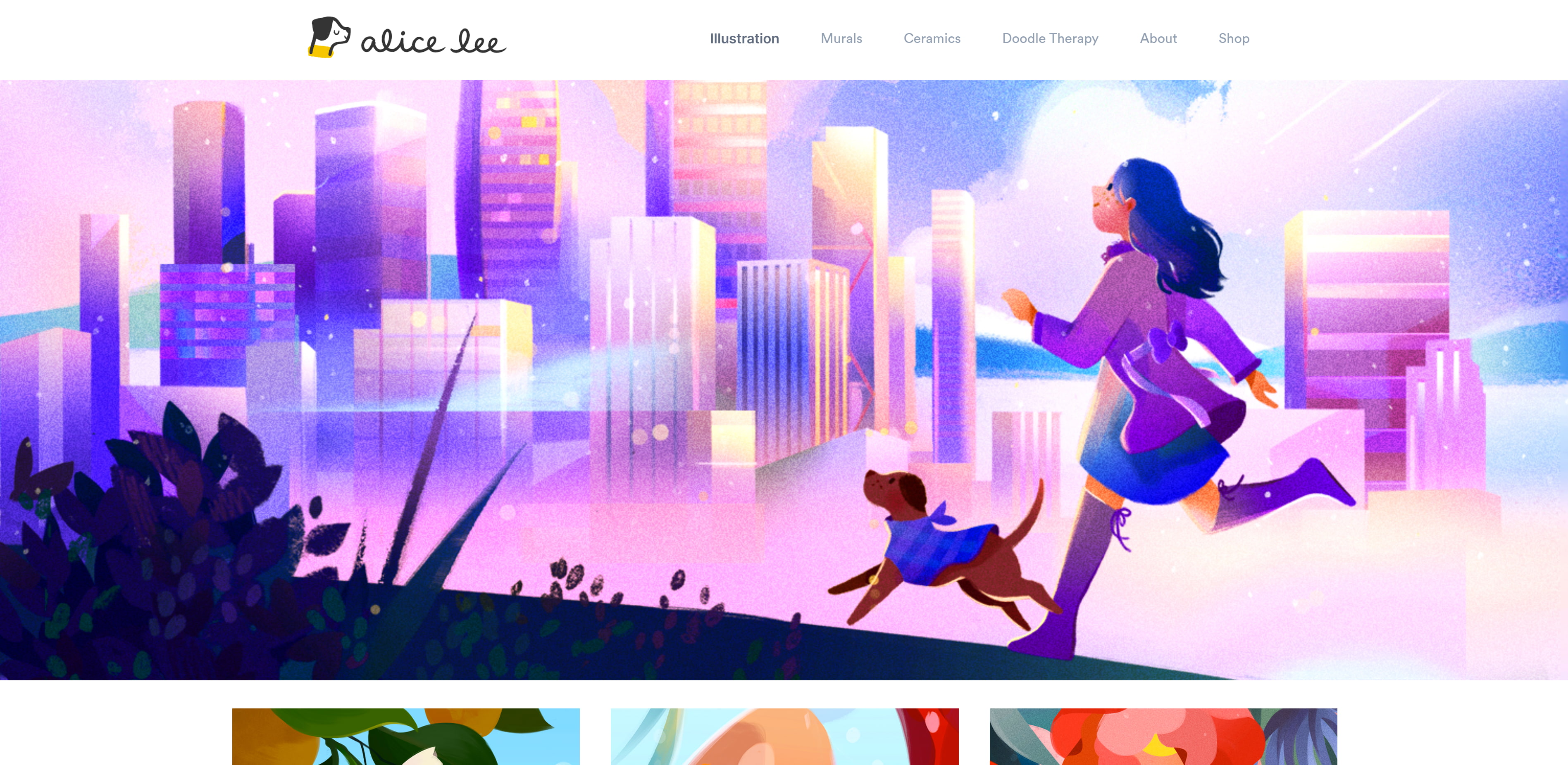
Alice Lee is a San Francisco-based illustrator, muralist, and the owner of this portfolio.
The first thing you’ll notice on this colorful website is the parallax effect built into the header image on the homepage. Parallax scrolling is a modern design technique that makes background images move slower than foreground ones, creating the impression of a 3D space. Alice uses it to make her cityscape shift when you hover over the image.
Alice’s website uses whitespace perfectly — the gaps between images keep the middle of the website compact while providing breathing room on the sides. The white background also complements the contrasting black text and vibrantly colored custom illustrations. Adding your own illustrations adds uniqueness to any modern website while showing potential customers your talent.
2. Astrology Club by Spotify
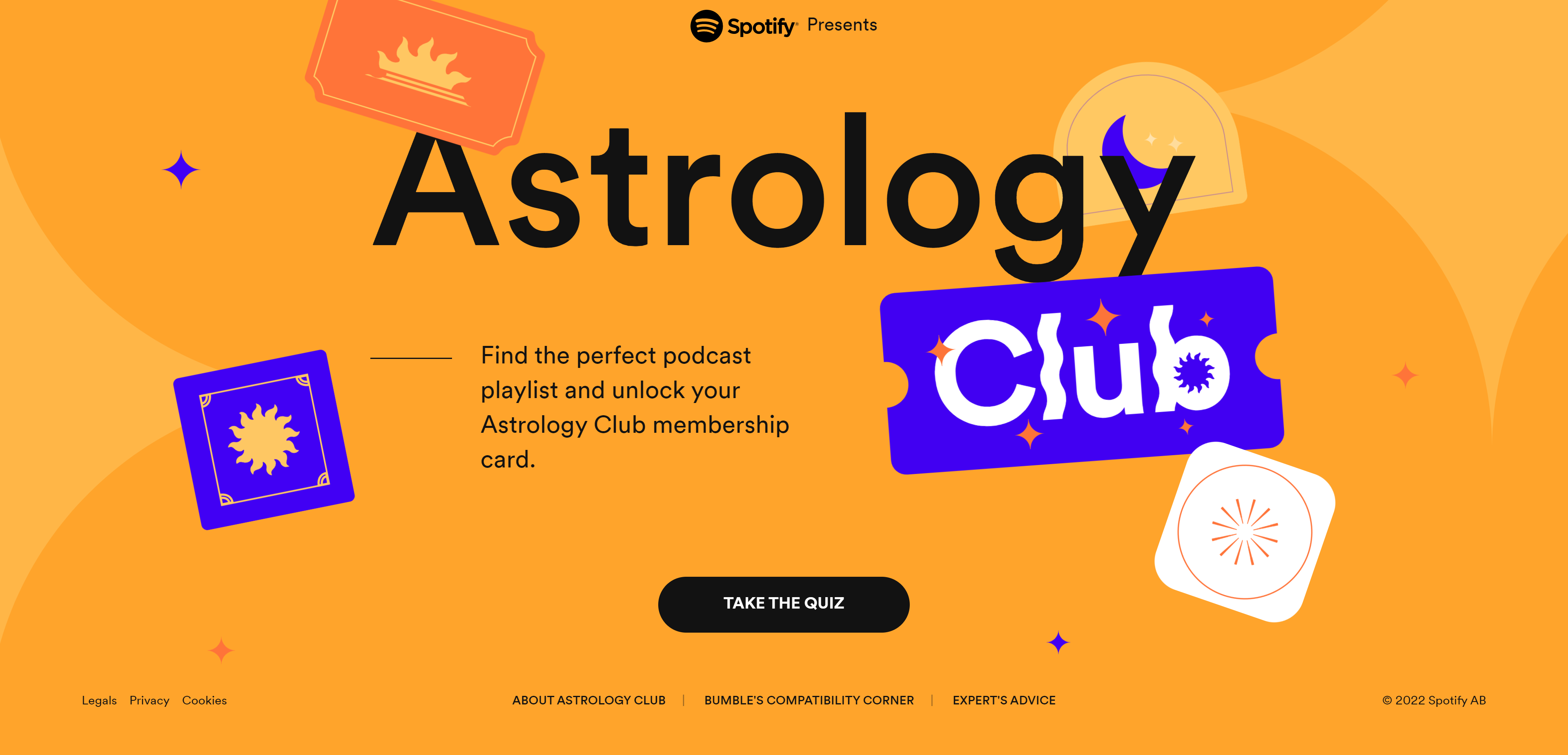
Astrology Club is an initiative by Spotify to increase awareness of its extensive podcast library.
Before reaching the home page, you’re met with a loading animation that takes you from 0-100% with an immersive visual design mimicking the phases of the moon. The wait is short, and the home page appears with floating stickers and a background that moves in relation to the cursor.
There’s a gentle soundtrack and a background that changes color as you navigate the site, keeping to a palette of rich orange, dark blue, and pale purple. Merging interactive animations and sound combines two sensory experiences to create a unique audiovisual experience. Gone are the days of simple text-and-image websites — the interactive and immersive quality of modern websites demands attention to every detail.

Get started for free
3. Mack & Pouya
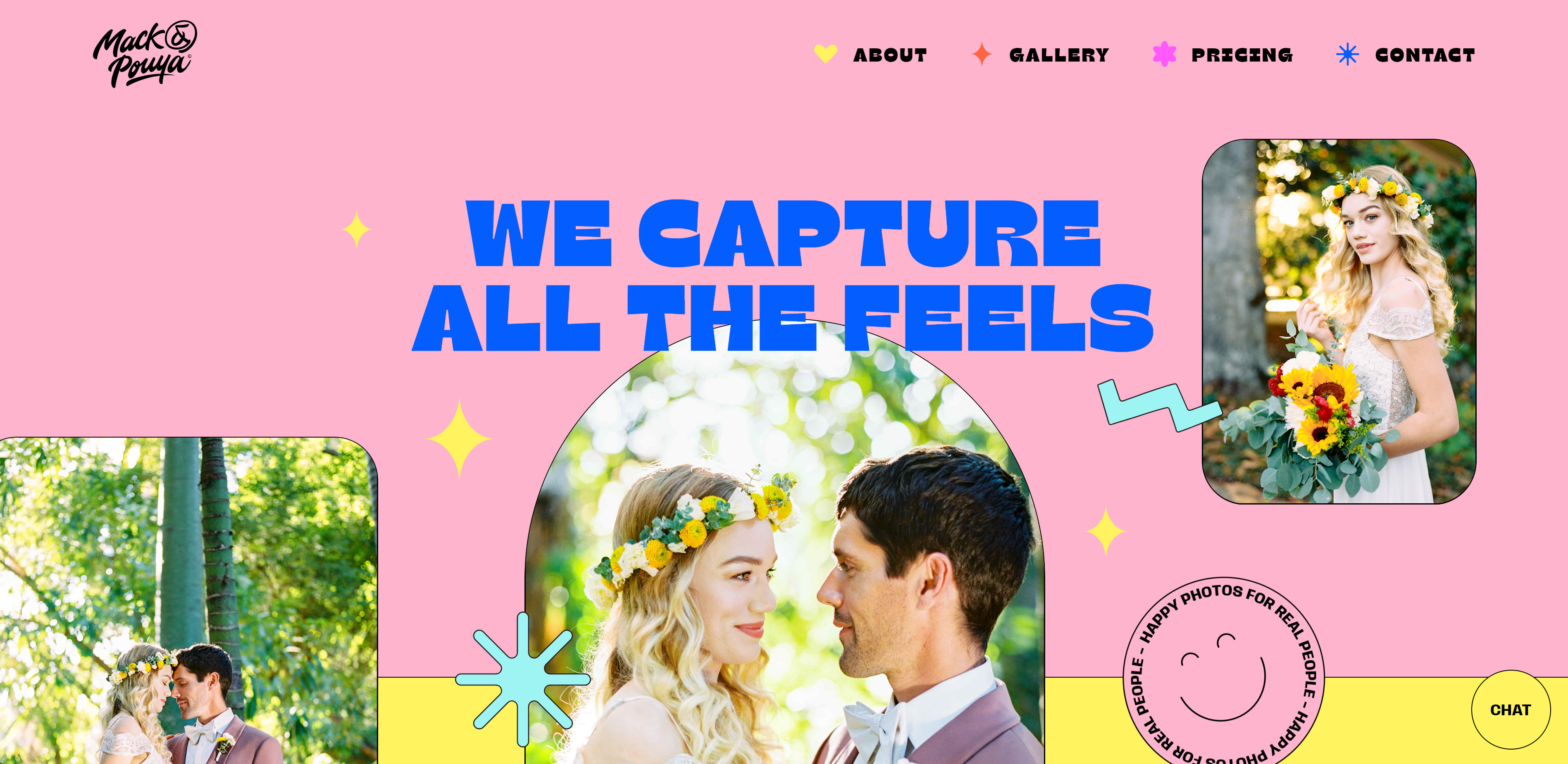
This website claims to “capture all the feels,” and we couldn’t agree more. Mack & Pouya are wedding photographers who deliver on the big blue heading of their landing page.
All the content fits onto this one-page website, making navigation simple. This maximalist website mimics the vibrancy and excitement of a wedding.
In the pricing section, interactive sliders, knobs, and a map of the US make up the “Build your own package” section. The price updates in the right corner as you adjust your needs, creating a live quote for their services. No need to wait for an email from the photographers or to click around the site searching for pricing information. You can determine if these services fit your budget right away.
The contact section has an illustration of a couple with colorful wedding-themed graphics surrounding them and the heading “CHECK FOR YOUR DATE.” This form lets you submit a request to see if Mack & Pouya are free on your big day without navigating to a new page.
If you scroll to the very bottom, you’re met with a bonus section: the background is black with the words “LOVE IS …” sprawled in big white letters across the middle. Several circles then rain into the screen with various words floating around in circles in a ball pit-like design to complete the sentence.
Overall, the website has a beautiful user interface with bold colors and an even bolder UX design. If you’re after web design inspiration for the best-in-class user experience, look no further than Mack & Pouya.
%201.jpg)